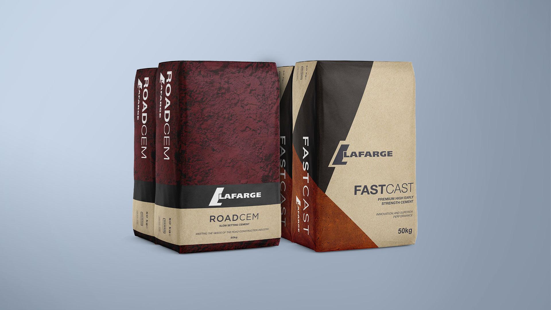
Lafarge Cements was launching two new types of cement and I was tasked with mocking up how the bags would look. The client wanted to elevate the design of the bags compared to the traditional look.
One look had to suit a range of various types of cement mixes and the other for their high-end mix. The standard look (on the left) would feature different images and colours per mix and the high-end mix (on the right) would feature a diagonal design taken from the “L” in their logo. Both designs would use deep, earthy tones to portray the high quality and refinement of their cement.